Chapter 2 Describing Data
§ 2.1 Categorical Data
- Categories
- Frequency, count
- Proportion, relative frequency
- Bar/Column Chart
- Pie Chart
- Notation for a Proportion
- Two-way tables for two categorical variables
- Multiple proportions in two-way tables
- total proportions
- row proportions
- column proportions
- Difference in proportions
- Comparative column charts
49% of Americans say affordable housing is a major problem in their area. Pew Research 2021
§ 2.2 One Quantitative Variable: Shape and Center p.72 (<1hr)
Key Concepts
- Use a dotplot or histogram to determine the shape of a distribution
- Understanding and calculating mean and median
- Identify the approximate locations of the mean and the median on a dotplot or histogram
- Understanding the impact of skewness and outliers on the mean and median
What is a distribution?
Data set examples
For each quantitative variable:
- Make a dot plot with StatKey
- Make a histogram with StatKey
- Make another histogram with StatKey
- Copy one of these on paper and plot the mean and median.
Frequency Tables and Histograms
- Frequency Table
- 6 to 20 classes
- Decide on number of class; find start and width
- Classes should be the same width
- There is no "best" histogram
- Relative and Cumilative frequency
Temperature Count Relative Cumulative 96.4 ≤ x < 96.82 1 1/25 0.04 96.82 ≤ x < 97.24 6 6/25 0.28 97.24 ≤ x < 97.66 3 3/25 0.4 97.66 ≤ x < 98.08 6 6/25 0.64 98.08 ≤ x < 98.5 6 6/25 0.88 98.5 ≤ x < 98.92 3 3/25 1
Shapes of Distributions
The skew is to the tail.
- Symmetrical
mean `~~` median
- Skewed left
mean < median
- Skewed right
mean > median
Measures of Center
- `bar(x)` = Mean = Arithmetic Mean = Average = Sum / Count
spreadsheet function=AVERAGE(data) - `m` = Median = middle when ranked
locator = `(n+1)/2`
spreadsheet function=MEDIAN(data) - Mode = most frequently occurring = good for qualitative data, among others
- The Law of Large Numbers and the Mean
Larger samples and/or repeated sampling will get `barx` closer to `mu`. - Interpreting the mean
- Context
- The average human body temperature is 97.6.
OK. - The average U.S. household has 2.53 people. (ref)
Wait. How can you have half of a person?
Right. OK.
The average U.S. household has between 2 and 3 people.
Thanks
§ 2.3 One Quantitative Variable: Measures of Spread
- Use technology to compute summary statistics for a quantitative variable
- Recognize the uses and meaning of the standard deviation
- Compute and interpret a z-score
- Interpret a five number summary or percentiles
- Use the range, the interquartile range, and the standard deviation as measures of spread
- Describe the advantages and disadvantages of the different measures of center and spread
- `s` = Standard Deviation of a Sample = `sqrt((sum (x-barx)^2)/(n-1))`
spreadsheet function=STDEV(data)or=STDEV.S(data) - `sigma` = Standard Deviation of a Population
- Range = max - min
- Examples: Mortality Rate by Country, in Sheets, Docs, StatKey, other
- Counting StDs and z-scores
- Can standard deviation help us find outliers? Unusual values?
We consider the extreme 5% of the data, this is often outside 2 standard deviations from the mean.
§ 2.4 Box Plots and Quantitative/Categorical Relationships
Goals
- Identify outliers in a dataset based on the IQR method
- Use a boxplot to describe data for a single quantitative variable
- Use a side-by-side graph to visualize a relationship between quantitative and categorical variables
- Examine a relationship between quantitative and categorical variables using comparative summary statistics
- Percentiles with Quantitative Data
- Percentile
- Percentile location, aka data index/position
- Percentile value
- Examples
- P10 is the 10th percentile, that is, the position in the data set were 10% of the data is at or below that point.
- Suppose we have a sample of size n=20. Then the position of P10 is 0.10*(20+1)=2.1, or the number in the 2nd position when ranked.
- Consider the Presidents ages:
Example: Age at Inauguration of 20th Century US Presidents42, 43, 46, 47, 51, 51, 51, 52, 54, 54, 55, 55, 56, 56, 60, 61, 62, 64, 69, 70So, P10=43
According to MS Excel or Google Sheets, P10 = PERCENTILE.INC(data,0.1) = 45.7
Close, but different from my method. There are other ways to identify percentile values that will be close to but different from each of these.
Oh, well.
- Quartile
- percentiles
- locators
- 5 different quartiles
- Quartile vs Quarter
- Interpretaion
Statistic Construction Teacher min 30 21 Q1 35 30 m 40 35 Q3 42 40 Max 46 43 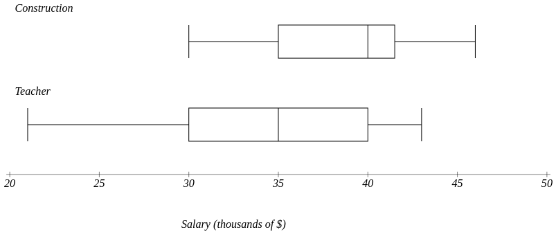
- 5 number summary and the Box Plot
- Extended InterQuartile Range
aka Outlier Fences, lower and upper
Lower Fence = `Q_1-1.5*IQR`
Upper Fence = `Q_3+1.5*IQR`
These values fence in "usual" data, hence give us a measure for outliers, aka, "unusual" data.